Tuesday, January 21, 2014

Reflection


     This is cliche, but it actually seems like no time has passed since we started posting on these blogs. It’s gonna be pretty hard to stop taking note of any interesting ads that catch my eye throughout the day. I’ve gotten so used to being hyper-aware of every media experience. Before this blog, I was aware of the idea of media and advertising as a whole, but never really focused on each individual idea out of the thousands that we come across on a regular basis. Doing this blog brought to light the sheer amount of media input we receive. It forced me to notice every ad instead of soaking it all in without a second glance.

     I've noticed that I've become a lot more interested in how advertisements are produced after analyzing so many on my blog. Whether I plan to put an ad on my blog or not, I still give a little more thought to how and why it is pitched to me that specific way. Just the other day, in fact, my dad and I were talking to each other about which brands have staying power based on their advertising techniques. I didn't have any blog posts due, but I was still happy to think about the pros and cons of each company's ads.

     Before I got to critical thinking class, and especially before I started posting on this blog, I thought of myself as relatively unaffected by advertising. I know what products I like based on their quality or comfort, so ads didn't seem to be a big part of my life. This blog made me realize how much advertising I take in daily and how much it affects me. Even if I think I am not influenced by an ad, there are ways for me to be subconsciously persuaded. So no, I was never "above it all." Just like everyone else in this country, my advertising intake and its affect on my life is very high.

     This blog has definitely made me a smarter consumer. Once I accepted how much advertising I receive, I could begin to break each ad down and analyze its intent. This helps me decide several things. Is the ad worth paying attention to? Is it honest? (Most likely, not.) What does the advertiser want me to do or think? What place in my brain is this ad trying to reach? This blog has helped me develop and answer those questions, and I think that that makes me a lot more media literate.

     Not everyone can take a class like critical thinking. Unfortunately, for many people, a class that develops media literacy could be the difference between mindless consumerism and intelligent, skeptical decision-making. Educated consumers are able to filter through deceptive ads and choose products based on honest traits and messages. Educated consumers are also able to stay confident when confronted with media. They can see through an advertiser whose sole intent is to make them feel insecure. Teaching people to become media literate will ultimately contribute to a more honest, positive, and happy society.

Sunday, January 12, 2014

H&M Photoshop


      I saw these photos on the web the other day, and they immediately reminded me of Miss Representation. A street artist has been pasting Photoshop toolbars onto ads for H&M. He aims to reveal the huge amount of retouching that is used in H&M ads, as well as throughout all advertising (especially ads that are directed towards women and girls). Many people don't realize the amount of digital work that takes place in between the original picture and the final product of ads like these. Ultimately, the woman in the ad probably looks nothing like that in real life.

     This relates to one of the main ideas in the documentary. Women and girls are given unrealistic stereotypes that they are expected to meet by both men and other women. In the case of this ad, and many others like it, the advertiser is creating an image that is physically impossible to recreate without digital retouching. It is literally unattainable. The problem is that many women and girls don't actually realize the facts behind advertising lies. This causes them to believe that it is possible to look like the woman in this picture and that they should strive to look like her. 

     Unfortunately, these misconceptions lead to real-life health issues, like eating disorders and body dysmorphia. Like Miss Representation pointed out, these issues make women feel inadequate because they do not look like women in ads. In reality, women in ads don't exist. The documentary showed us how in today's society, women don't make their voices heard because they feel they cannot meet standards. Their perception of these standards comes in part from the lies spread by the media, specifically advertisers.

     The cruel goal of many companies is simply to make women feel insecure. On paper, it's a great strategy: make your consumers feel bad about themselves. Make them think that your product will make them better. Make them buy your product. In reality, this incredibly common advertising technique is creating a generation of women who feel like they are lacking physical traits that make them more appealing. And it will continue to happen if ads like these are not exposed. 

      I really love what this artist is doing. Even if it's considered graffiti or defacement, it's important to get this message out to every consumer who sees these ads. People need to be aware of how disconnected these ads are from reality and how transparent these advertisers really are. It's going to be hard to alter a culture of insecurities and unrealistic expectations, but with artists like this and powerful messages like those presented in Miss Representation, we're on our way.

Sunday, January 5, 2014

H&M Times Square


     I was in New York City over winter break, and we walked through Times Square a few times. This is a picture of H&M's largest store in the city. It's a little hard to read, but the phrase at the top says, "H&M loves Times Square."

     It's really hard to focus on single ads when you're immersed in the flashing lights and billboards of Times Square. It's kind of like the hub for all things consumer-oriented. Even so, this huge store's advertising stood out to me. As we got closer and closer to the actual building, the same phrase, "H&M loves Times Square," would pop up in smaller posters and screens along the way. This continued until, by the time we got to the main store, the phrase was pretty much ingrained in our heads. This is pretty impressive, considering the enormous amount of ads trying to work their way in.

     This particular phrase suggests that the H&M brand and shopping experience is a very important part of the tourist attraction that is Times Square. Not only does H&M love Times Square, but Times Square (and every consumer in it) loves H&M back, or so the company would have you believe. It's interesting because while there are many examples of a brand trying to become essential to a specific emotion, like Starbucks becoming one with holiday cheer, it's less common for a brand to try to associate itself with a certain place. These two strategies are pretty similar, though. As H&M becomes intertwined with Times Square, it also becomes a part of the emotions one feels in Times Square: awe, happiness, entertainment, etc. When tourists see this ad, it's just accepted. Of course H&M loves Times Square. It's awesome here! And, as H&M probably hopes, those feelings will automatically become associated with their brand.

     I think this ad is pretty effective. It's a simple way of creating a positive vibe for the brand. H&M is just taking advantage of the fun that everyone thinks of when they think of Times Square. And, judging by all the H&M bags I saw, they're right.

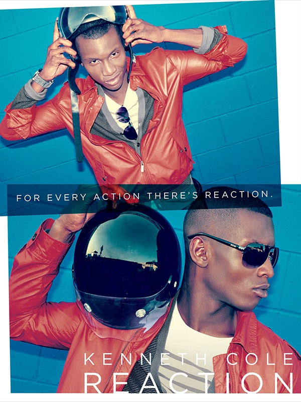
Kenneth Cole Reaction


     I saw a version of this advertisement tucked away in a corner of Macy's last week. I think it's hilarious. It is advertising the designer Kenneth Cole's new brand of fragrance, clothes, shoes, and accessories. The phrase in the middle reads, "For every action there's reaction."

     Obviously, the phrase caught my eye first. "For every action there's reaction" is very, very vague. I have no idea what Kenneth Cole is trying to convey to the consumer here. I can take a guess: maybe he's saying that the action of purchasing his clothes or perfume will cause a positive reaction from your peers? It seems like a perfect example of Weasel Words. The phrase uses striking words like "action" and "reaction" to attempt to create a feeling of power and control over one's situation. The only problem is that the words are incredibly easy to misinterpret, making the ad pretty confusing to the consumer. Also, it doesn't give any real information about the nature of the products themselves.

     The model in the ad does seem to be advertising Kenneth Cole's clothing line. Unfortunately, the main phrase is so difficult to understand that it makes the rest of the ad hard to grasp. The jacket he's wearing is bright orange, so that's very central to the picture, but I would say that in both images his face is equally as central as the clothes he's wearing. This advertises the model's good looks just as much as the products.

     This ad appeals to the Needs for Prominence and Autonomy. The ad is saying that by buying and wearing Kenneth Cole Reaction clothes and perfume, you will be elevated to a high social status where every thing you do will influence those beneath you (assuming that my interpretation of the action/reaction phrase is correct). The orange jacket makes the model stand out, and he looks really cool in a motorcycle helmet and dark glasses. All of these things create a feeling of admiration, uniqueness, and superiority.

     Overall this ad would have been okay if the phrase was not there. With the phrase there, the whole message becomes sort of foggy.

Saturday, December 21, 2013

Starbucks Caramel Brulee Latte


     This advertisement stood out to me at Starbucks earlier today. Its bright red color was particularly eye-catching, and it was also placed right next to the register where I was purchasing my coffee. Starbucks is known for its huge holiday campaigns, with new drinks every year around Christmastime. All the stores suddenly become decorated in holiday style with red, gold, and green accents. It's like walking into Santa's workshop, but instead of toys, there's coffee.

     The writing on this ad reads, "Create Wonder. Share Joy. Caramel Brulee Latte." Those words really caught my eye because they are a perfect example of Vagueness and Glittering Generalities. The words "wonder" and "joy" are pretty ambiguous-- what do they even mean? They could be interpreted in countless ways by different people. The action verbs "create" and "share" are appealing because they suggest togetherness and holiday spirit, but they don't really have meaning in the ad. The words overall convey a feeling of happiness because they have a generally positive connotation, but it's hard to decipher what they actually signify.

     The first two phrases are followed by the actual product: a Caramel Brulee Latte, one of Starbucks' holiday favorites. The drink itself is drawn in cartoon form. It is surrounded by swirls and flowers of red and maroon. The overall effect makes it seem like the latte is some sort of magic drink. Once you drink it, you will be transported to a place of holiday cheer that can't be reached in any other way. In reality, the ad doesn't say much about the drink's actual ingredients or flavor. It could be concentrated spinach with whipped cream on top, for all we know. Even so, it's really appealing because of the phrases above it and the colors around it.

     This ad reminded me of many of the commercials and print ads we looked at in class this week because it attempts to embody a certain feeling or emotion. In this case, Starbucks is trying to say that the Caramel Brulee Latte is absolutely necessary to the feeling of holiday spirit and the magic of Christmas. Can a drink actually achieve this? We'll have to take their word for it.

Cartier


     I found this advertisement in a fashion and beauty magazine the other day. It is a two-page spread advertising the jewelry brand Cartier's diamond rings. The phrase on the right page reads, "True love has a color and a name." The background depicts the Eiffel Tower in Paris, France, and there are white roses in the foreground along with the red box and rings.

     The first thing that stood out to me in this ad was the statement on the right. It seems like Cartier is trying to say that their products are the definition of true love. "True love has a color and a name": the color is red and the name is Cartier. They're saying that that box with the rings inside is an integral part of the feeling of true love, and you can't feel that emotion without Cartier brand jewelry.

     This ad appeals to the need for prominence. It displays several items that are generally associated with wealth, sophistication, and class. Aside from diamond rings, which are of course expensive, high-end products, the ad includes white roses and the Eiffel Tower. Roses, especially red and white ones, definitely embody that feeling of elegance that comes along with the need for prominence. The Eiffel Tower is a popular tourist destination, but it also symbolizes a fashionable and chic style coveted by many. Conveniently for Cartier, these items are also associated with love (the theme of the ad). Roses are traditionally given to loved ones and the Eiffel Tower is located in Paris, the city of romance.

     This ad also appeals to the need for affiliation, especially because it suggests that Cartier products are a necessary part of a loving relationship. By giving someone those diamond rings, you can achieve true love and romance, which no other brand can produce. Obviously, that assertion isn't accurate. Love is an emotion that is based on non-tangible feelings, and no materialistic item can replicate those feelings.

Sunday, December 15, 2013

Volkswagen Passat


     This ad for the 2012 Volswagen Passat caught my eye on YouTube. It shows a little kid dressed in a Darth Vader costume, trying to use the force to make things around the house move. When his dad gets home, the kid tries to use the force on the car (a Passat). From inside the house, his dad clicks a button on his keys and the car turns on. The mini Vader believes he really does possess the force, just like the characters in Star Wars.

     I thought this ad did a very good job entertaining the audience, although the content seemed kind of random. Showing the kid running around using the force was very cute, and it definitely made me laugh. They used the Need to Nurture as well, displaying a mother making lunch and father wanting to please his son. I can see that if I were a parent, this ad would be really appealing. It would make me think that the Passat is a way to connect with my child, even though it is really just a car.

     The music in the background was essential to the entertaining and entrancing aspect of the ad. They played the traditional Darth Vader song. Almost everyone has seen Star Wars, and nearly everyone knows this song when they hear it. It made me think of when I was younger and would play games like that. I'm sure it had the same effect on other viewers. The familiarity of the song made the car seem like a necessity of childhood.

     The only issue with this ad is the disconnect between the actual product they are trying to sell and the plot of the commercial. They spent a lot of time entertaining the audience with a cute little kid and some fond childhood memories, but when the car showed up at the end, it seemed a bit random. I understand that they were displaying the car's ability to turn on when a button is pressed on a key from a distance. But, that's only a minute feature of the vehicle as a whole. It almost seemed like they were trying to make the automobile seem magic as it helped the kid achieve his goal of using the force. In reality, the Passat is just another car, and to top it off, the viewer receives no other information about it other than the key feature.